How the air quality index works is simpler than it sounds: a monitoring station measures the concentration of six specific pollutants, each concentration is turned into a sub-index using a table of breakpoints, and the worst of those six numbers becomes the single AQI you see on your phone. Nothing about that number is a direct measurement of air. It is a conversion, and once you know the conversion, the reading makes sense.
This matters because the AQI is the most widely used piece of air quality information in the world, and most people never look past the label. “Unhealthy for sensitive groups” sounds alarming until you know that the number behind it is often driven entirely by ozone on a sunny afternoon, which behaves nothing like the particle pollution driving a wildfire reading.
Below is the whole pipeline, from raw sensor data to the color on your screen, plus what to actually do with the number once you have it.
Table of Contents
- What Is the Air Quality Index?
- How the Air Quality Index Works: From Measurements to One Number
- How the air quality index works, step by step
- A worked example with PM2.5 at 28.6 micrograms per cubic meter
- Why the number jumps in uneven steps
- Which Pollutants Are Included in the AQI?
- What Do the AQI Numbers and Colors Mean?
- Why Can Two Air Quality Reports Show Different Numbers?
- How Do You Use an AQI Forecast?
- Frequently Asked Questions
- Is PM2.5 the same as AQI?
- At what AQI should you stay inside?
- How bad is an AQI of 300?
- Why do different apps show different AQI numbers for the same place?
- How much AQI equals one cigarette?
- What AQI level is safe for exercise?
- Conclusion
What Is the Air Quality Index?
The Air Quality Index is a standardized scale that compresses several pollutant concentrations into one number designed to communicate health risk. On the US scale it runs from 0 to 500. Lower is better; higher is worse.
It was designed as a communication tool rather than a scientific measure. Raw pollutant concentrations are expressed in units like micrograms per cubic meter, parts per million or parts per billion, and those numbers mean very little to a parent deciding whether to take a toddler to the park. The AQI turns them into an integer with a color and a sentence attached.
The people who rely on it include schools deciding whether to hold outdoor classes, hospitals issuing advisories, employers scheduling outdoor shifts, and roughly anyone who wants to know whether to open the window or run the purifier instead.
Two distinctions trip people up constantly, so they are worth stating up front:
- AQI is not a concentration. A PM2.5 reading of 28.6 micrograms per cubic meter and an AQI of 87 describe the same moment, but they are different kinds of number. The first is a measurement with units. The second is a risk translation without units.
- AQI is not the same in every country. The US scale, India’s CPCB scale, China’s scale and the European bands all describe themselves as “the AQI” and they do not agree on a single reading of dirty air.
How the Air Quality Index Works: From Measurements to One Number
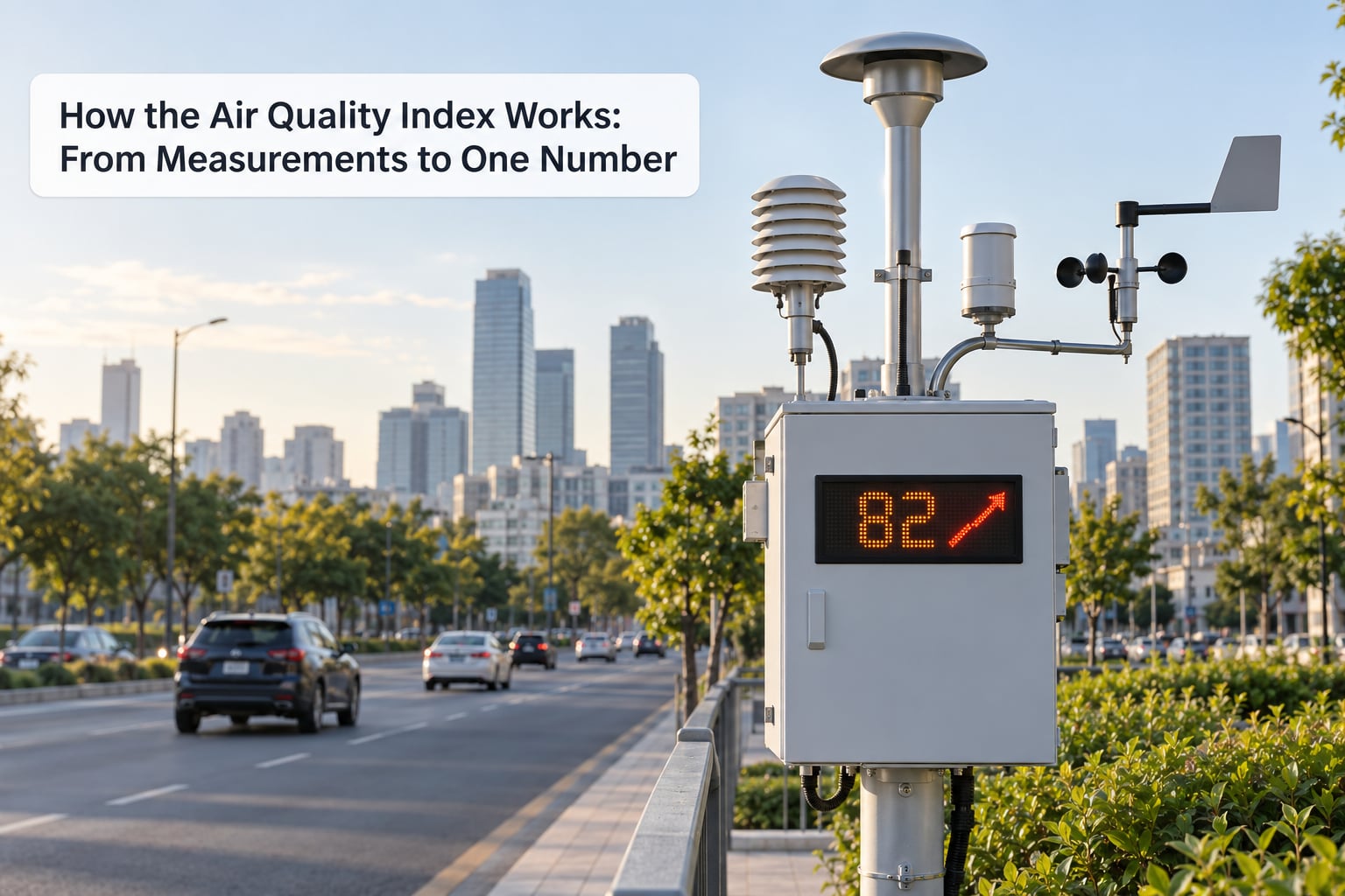
The AQI is calculated, not measured. A regulatory monitor draws air through an inlet, separates particles by size with a filter, and measures light scatter or attenuation to estimate mass concentration. Ozone monitors use a chemical reaction, carbon monoxide monitors use infrared absorption, and each instrument reports a concentration several times an hour.
Those raw concentrations then pass through four steps to become the number on your screen.
How the air quality index works, step by step
Step 1: Average the right time window. Each pollutant has a specified exposure period defined by regulation, because different pollutants act on the body at different speeds. PM2.5 and PM10 use a 24-hour average. Ozone uses an 8-hour average. Sulfur dioxide and nitrogen dioxide use a 1-hour average. Carbon monoxide uses an 8-hour average. A single hourly spike in ground-level ozone can be harmless; the same level sustained across eight hours is not.
Step 2: Truncate the concentration to the required precision. Truncation means discarding decimals, not rounding them up. PM2.5 is truncated to one decimal place. PM10, ozone, nitrogen dioxide and carbon monoxide are truncated to whole numbers. Sulfur dioxide is truncated to whole parts per billion. This rule exists so that two agencies holding the same raw reading always publish the same index value rather than differing by one point through rounding choices.
Step 3: Find the breakpoint band and interpolate. This is the core of AQI calculation, and it uses piecewise linear interpolation. Each pollutant has a breakpoint table that pairs a range of concentrations with a range of index values. The concentration is inserted into the middle of that band, and a linear formula stretches it across the index range.
The formula is the same for every pollutant:
I = ((Ihigh − Ilow) / (Chigh − Clow)) × (C − Clow) + Ilow
Where C is the truncated concentration, Clow and Chigh are the concentration bounds of the matched band, and Ilow and Ihigh are the index bounds of that same band. The result is then rounded to the nearest whole number to get the pollutant’s sub-index.
Step 4: Take the highest sub-index and label the pollutant. This is called the responsible pollutant, sometimes the primary pollutant. The reported AQI is the maximum of the six sub-indexes, and whichever pollutant produced it gets named. That single rule explains a lot of confusing readings.
A worked example with PM2.5 at 28.6 micrograms per cubic meter
Suppose a monitor reports a 24-hour PM2.5 average of 28.6 micrograms per cubic meter. Under the current US breakpoint table, the Good band for 24-hour PM2.5 runs from 0.0 to 9.0 and maps to index values 0 to 50. The Moderate band runs from 9.1 to 35.4 and maps to 51 to 100.
Step one, truncation: 28.6 is already at one decimal place, so nothing changes.
Step two, band selection: 28.6 falls inside 9.1 to 35.4, so Clow = 9.1, Chigh = 35.4, Ilow = 51, Ihigh = 100.
Step three, solve:
I = ((100 − 51) / (35.4 − 9.1)) × (28.6 − 9.1) + 51
I = (49 / 26.3) × 19.5 + 51
I = 1.8639 × 19.5 + 51
I = 36.35 + 51 = 87.35, which rounds to an AQI of 87.
An index of 87 lands in the Moderate band, which is described as acceptable, with some people particularly sensitive to ozone or particle pollution at risk.
Now the part that causes the arguments online. That same afternoon, suppose the ozone station reports an 8-hour average of 0.086 parts per million. Its band table maps a concentration of 0.086 to a sub-index of about 90. The reported AQI becomes 90, not 87, and the responsible pollutant is ozone. The air did not get meaningfully worse; the index just switched to reading a different pollutant.
Why the number jumps in uneven steps
Because the bands are narrow at one end and wide at the other, a fixed change in concentration can move the index by very different amounts. In the upper reaches of PM2.5, one microgram per cubic meter spans roughly a third of an index point. Near the top of the Good band, one microgram can move the value by five or six points. That non-linearity is intentional. The bands are drawn so that each category boundary corresponds to roughly the same jump in health risk, which a straight-line concentration scale cannot deliver.
Which Pollutants Are Included in the AQI?
The US index uses six criteria pollutants. Each has a distinct source profile, a different averaging window and a different unit, which is why a single app number can behave in ways that surprise people.
| Pollutant | Unit | Averaging window | Main sources |
|---|---|---|---|
| PM2.5 | micrograms per cubic meter | 24 hours | Combustion, traffic, wood burning, wildfires |
| PM10 | micrograms per cubic meter | 24 hours | Road dust, construction, agricultural particles |
| Ozone (O3) | parts per million | 8 hours | Formed in sunlight from traffic emissions and solvents |
| Carbon monoxide (CO) | parts per million | 8 hours | Incomplete combustion from vehicles and generators |
| Sulfur dioxide (SO2) | parts per billion | 1 hour | Power plants, industrial processes, shipping |
| Nitrogen dioxide (NO2) | parts per million | 1 hour | Vehicle exhaust and combustion sources |
A few things stand out in that table. PM2.5 is the fine fraction that reaches deep into the lungs and then the bloodstream, which is why it dominates health guidance in most places. PM10 is coarser, gets filtered higher up in the airway, and spikes during dust events. Ozone is not emitted directly; it is manufactured in sunlight from nitrogen oxides and volatile organic compounds, which is why it peaks in the afternoon and drops overnight.
That timing creates the most common source of daily confusion. Particle pollution is usually worst in the morning and overnight under a temperature inversion, while ozone is usually worst in the mid-afternoon. On a clear summer day, an AQI of 45 at 8am can be followed by an AQI of 145 at 3pm driven by a completely different pollutant, then fall back to 70 by sunset.
National systems do not all use this same set. The European index reports bands rather than index numbers and uses hourly rather than 24-hour particle averages, so a European “Poor” day can coexist with a US “Moderate” reading for identical air. India’s CPCB scale runs 0 to 500 but with its own bands, labeled Good, Satisfactory, Moderate, Poor, Very Poor and Severe, and its breakpoints for PM2.5 differ enough that the same concentration can land two full categories apart. Satellite and low-cost sensor networks add another layer, since they often report a real-time concentration rather than a regulatory 24-hour average.
What Do the AQI Numbers and Colors Mean?
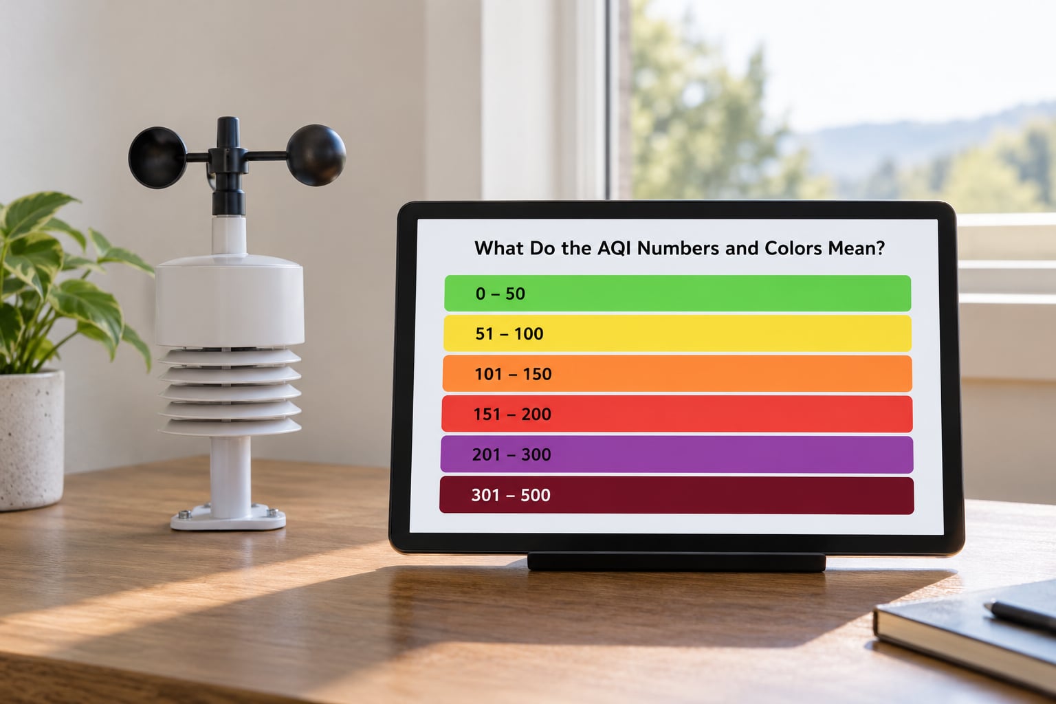
The US scale splits the 0 to 500 range into six categories, each with its own color and its own guidance. The color is not decorative. It was added so the information works for people who cannot or do not read the number.
| AQI | Category | Color | What it means for health |
|---|---|---|---|
| 0–50 | Good | Green | Air quality is satisfactory and poses little or no risk. |
| 51–100 | Moderate | Yellow | Acceptable, but unusually sensitive people should consider reducing prolonged exertion. |
| 101–150 | Unhealthy for Sensitive Groups | Orange | Risk for people with heart or lung conditions, children and older adults; everyone else can usually continue normal activity. |
| 151–200 | Unhealthy | Red | Everyone may begin to feel effects. Limit prolonged or heavy outdoor exertion. |
| 201–300 | Very Unhealthy | Purple | Health alert. The risk is raised for everyone; avoid outdoor exertion and stay indoors with filtered air. |
| 301–500 | Hazardous | Maroon | Emergency conditions. Everyone is more likely to be affected; remain indoors and keep indoor air as clean as possible. |
The single biggest practical point is that the first three bands are not a pass or fail line for everyone. An AQI of 120 is often perfectly fine for a healthy 30-year-old running an easy mile, and genuinely risky for a 7-year-old with asthma. The category tells you which group the caution is for, and most of the caution sits with sensitive groups until the number passes 150.
People also read the label without reading its time horizon. “Unhealthy for Sensitive Groups” describes an exposure, not a moment, and the exposure is the averaging window that pollutant uses.
Why Can Two Air Quality Reports Show Different Numbers?
If you check the air quality in one city on a phone app, a government website and a news broadcast and get three numbers, nothing is necessarily broken. Six separate things can produce a disagreement.
Distance. Air quality varies street by street. A monitor near a busy intersection, a monitor in a park, and a monitor at an airport will not agree. Regulatory stations are placed for regulatory reasons, which sometimes puts them nowhere near the densest population.
Time of day. A particle monitor and an ozone monitor have opposite daily rhythms. A snapshot taken at 7am and one taken at 3pm can land in different categories for entirely different reasons.
Averaging window. A regulatory 24-hour particle average and a real-time hourly concentration are answering different questions. During a wildfire, an hourly reading can be several times higher than the rolling 24-hour value simply because the last twenty-four hours were cleaner.
National scale. A US-based app applied to a city that reports on the CPCB scale will produce a number that looks authoritative and does not match local reporting. This is a routine source of confusion for users in India, China and elsewhere who see US-style scales in travel guides and international apps.
Sensor quality. Consumer sensors need calibration, drift and are affected by humidity and placement. A sensor sitting on a sunny windowsill will report differently from one on a shaded shelf. Forum discussions about personal monitors running higher than the official station usually come down to either humidity or placement, not a broken device.
Breakpoint table version. The US particulate breakpoint table was revised in 2026, which tightened the Good and Moderate boundaries. Monitors, apps and printed charts built before the change will still apply the old numbers, so a device bought several years ago can understate the index for the same PM2.5 concentration.
When two numbers conflict, the tiebreakers are: prefer the official national or local agency feed, prefer raw concentration in micrograms per cubic meter over an index, and check which pollutant is named as responsible.
How Do You Use an AQI Forecast?
A forecast is useful only if it changes something you do. Here is the sequence that gets you the most out of one.
Read the number and the category together. The number tells you where on the scale you are; the category tells you who the caution applies to. An index of 110 with ozone named behaves very differently from an index of 110 with PM2.5 named, because ozone responds to time of day while particle pollution does not.
Plan the time of your activity. With ozone in charge, moving a run to early morning or after sunset often drops the exposure substantially with no change to your day. With particle pollution in charge, timing matters less; the concentration holds through the day.
Adjust for the sensitive group, not the average person. People with asthma, COPD, heart disease, diabetes, children and older adults should act at the first orange band rather than waiting for red. If anyone in that group takes medication, the local air quality guidance and their clinician’s plan take priority over a general article.
Decide ventilation by comparing two numbers, not one. Open windows when the outside AQI is meaningfully better than your indoor reading. If you have no indoor monitor, the practical rule is that outdoor AQI under about 50 makes ventilation worthwhile, and anything above 100 makes it counterproductive unless you filter what comes in. Running a purifier and keeping windows closed often beats open windows in dirty air, and the energy cost is worth paying on high-pollution days.
Know what filtration can and cannot do. Particle filtration handles PM2.5 effectively. It does nothing for carbon monoxide or nitrogen dioxide, and standard particle filters do not remove gases, so a purifier that solves your smoke problem will not solve a traffic-corridor problem. A carbon stage addresses some gaseous pollutants at the cost of needing replacement.
Use raw concentration when you can. The index compresses a lot of information into one number, but it is not a dose. If you need a real answer about exposure, look for the micrograms per cubic meter figure for PM2.5 and compare it against health guidance from your national health authority. Follow local public-health alerts when conditions turn severe; they carry advice tailored to local conditions that a general app cannot.
One last practical habit worth building: check twice a day rather than once. Ozone-driven cities and particle-driven cities have opposite peaks, and a single morning glance will mislead you in one direction or the other.
Frequently Asked Questions
Is PM2.5 the same as AQI?
No. PM2.5 is a measurement of particle mass concentration in micrograms per cubic meter. AQI is a risk index built from six pollutant concentrations, including PM2.5. A PM2.5 value of 28.6 micrograms per cubic meter converts to an AQI of about 87, but the two numbers are not interchangeable and the conversion depends on the breakpoint table in use.
At what AQI should you stay inside?
Consider staying indoors with filtered air once the AQI reaches 201, which is the Very Unhealthy band and a health alert for everyone. Sensitive groups, including people with heart or lung conditions, children and older adults, should reduce prolonged outdoor exertion from 101 upward. Below that, normal activity is generally fine for most healthy adults, though there is no threshold at which exposure becomes zero risk.
How bad is an AQI of 300?
An AQI of 300 falls in the Very Unhealthy band and signals a health alert, with raised risk for everyone rather than only sensitive groups. This range is usually associated with heavy wildfire smoke or severe pollution episodes, where guidance is to stay indoors, close windows, run filtration and avoid outdoor exertion until conditions improve. If someone in your household has a respiratory or heart condition, follow your clinician’s plan and local health alerts.
Why do different apps show different AQI numbers for the same place?
The usual causes are distance from the nearest official monitor, the time of day you checked, whether the app reports a 24-hour rolling average or a live concentration, and which national scale the app uses. Consumer sensors add another variable because they need calibration and are sensitive to humidity and placement. Prefer the official agency feed and compare raw micrograms per cubic meter when two apps disagree.
How much AQI equals one cigarette?
There is no official conversion, but a widely cited exposure study estimated that breathing a 24-hour average of about 70 micrograms per cubic meter of PM2.5 delivers a fine-particle dose comparable to smoking roughly one cigarette per day. Treat it as a sense of scale rather than a measurement tool. The comparison applies to fine particles over a full day, not to a brief outdoor exposure or to other pollutants.
What AQI level is safe for exercise?
Outdoor exercise is generally fine for healthy adults below 100, though some people notice irritation in the 51 to 100 band. From 101 to 150, sensitive groups should shorten or move the session indoors and keep intensity moderate. Above 150, heavy outdoor exercise is a poor idea for anyone, and above 200 it should be avoided altogether. If ozone is the responsible pollutant, moving the session to early morning or evening helps a great deal.
Conclusion
The AQI is a translation layer, not a measurement. Concentrations are averaged over a pollutant-specific window, truncated to a fixed precision, converted through breakpoint tables using piecewise linear interpolation, and the highest of the six sub-indexes becomes the number you see.
So the useful habit is short: check your national agency’s official feed, look at the number and the category, find which pollutant is named as responsible, and let that shape your activity. If two sources disagree, compare the raw PM2.5 concentration rather than the index. For anything involving a respiratory or heart condition, follow your clinician’s plan and local public-health alerts ahead of any general guidance.